US TRADING
Redesign | Brand Guidelines
Road safety
Kerning
Graphic design
2024
UST is a company dedicated to the import and distribution of Personal Protective Equipment and Road Safety products. With over 5 years of experience, they are committed to safeguarding the health and safety of employees and workers in the Dominican Republic. Their focus extends beyond employee and company safety; They also protect the goods by supplying high-performance packaging products and disposable materials to support the production processes.
-
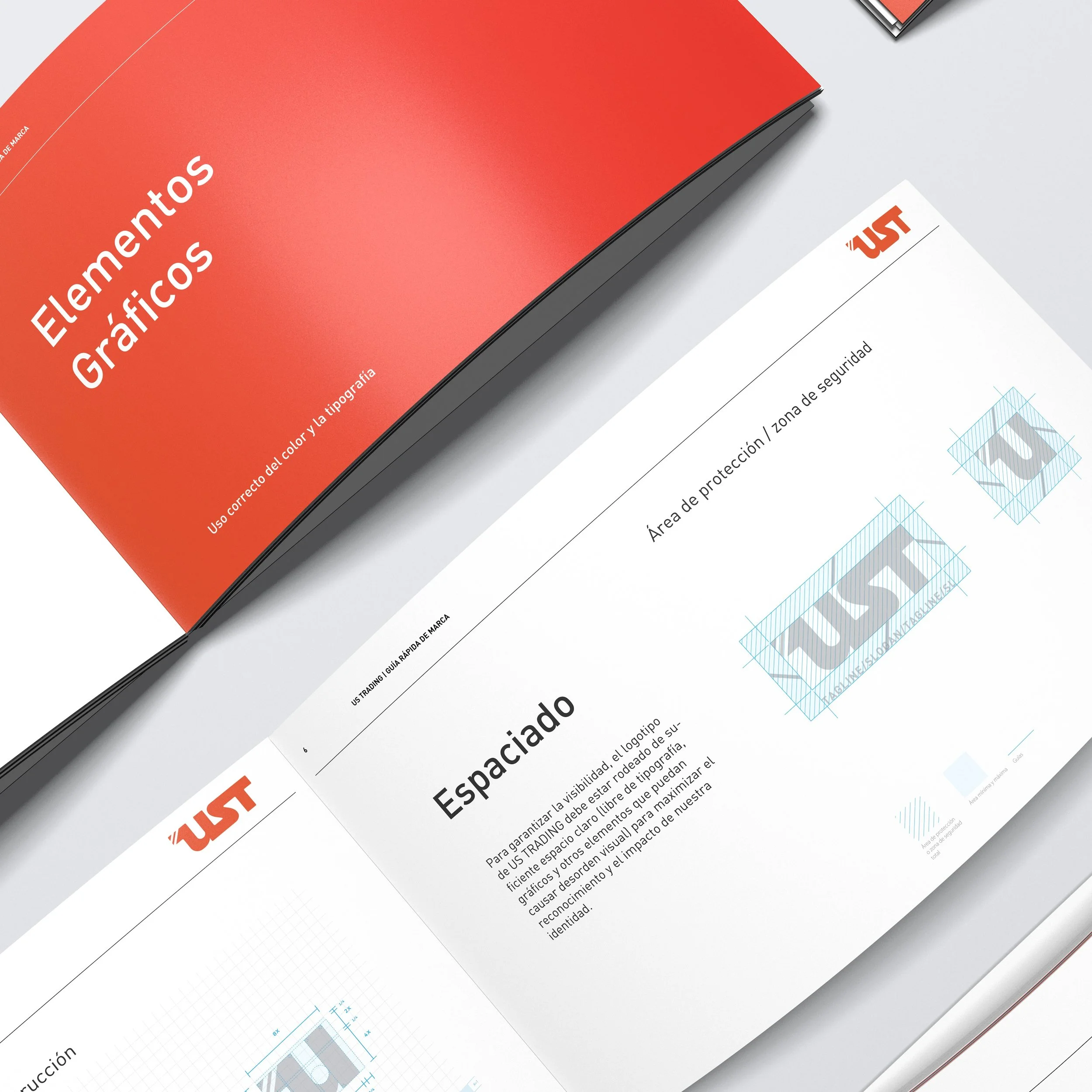
UST Trading approached us with the goal of digitizing their logo, sparking an opportunity to elevate their entire brand identity. This process evolved into a comprehensive redesign, where we carefully separated the letter "U" to serve as a versatile submark, enhancing the logo’s adaptability across various applications. Beyond logo refinement, we guided UST Trading in selecting a distinctive brand typography that resonates with their values, ensuring cohesion across all visual communications. We also crafted detailed brand identity guidelines to support consistency in every interaction. This comprehensive approach strengthened UST Trading’s visual presence and set the foundation for a recognizable, memorable brand.
-
To address this challenge, we employed precise kerning techniques, carefully adjusting the spacing between each letter. This approach ensured a more balanced visual weight across the logo, enhancing its readability and cohesion. The improved letter distribution brought a polished, professional look, allowing the brand to communicate its identity effectively and clearly.
In the selected color palette, three shades of gray blend seamlessly with a striking, vibrant orange, creating a balanced look that exudes both energy and stability.
The range of grays contributes a sense of sophistication and grounding, while the orange brings in a lively, energetic touch that draws attention and adds warmth. Additionally, a carefully chosen blue acts as the accent color, adding contrast and a pop of coolness to the overall scheme. This combination is designed to be modern and dynamic, with each color playing a distinct role to enhance the palette's versatility and appeal.
For the Typography selection we went for a modern and functional sans type font. FF DIN is a modern typeface inspired by classic sans-serif styles like Helvetica but designed to offer a more contemporary and functional look, Very often used in Signage. -
Expertise:
Branding, Corporate Identity, Art Direction, 3D Modeling, Color Theory, Typography Selection.
Tools:
Adobe Photoshop, Illustrator, InDesign, Cinema 4D,
Keywords:
Construction - Road Safety - Protection - Business - Equipment- Safety - Materials - Distribution
This project has been possible thanks to US Trading.


