CORREY ACADEMY
CORPORATE IDENTITY
Coaching & Fitness
Branding
Graphic design
2022
Correy Academy is a fitness learning platform located in Costa del Sol, Spain, and founded in 2022. Their main goal is to deliver products and services that improve human quality through education, nutrition, supplementation and training. Their vision is to build a a relationship between the academy and its community providing them information of value, strategic tools and methods to improve their lives and habits.
-
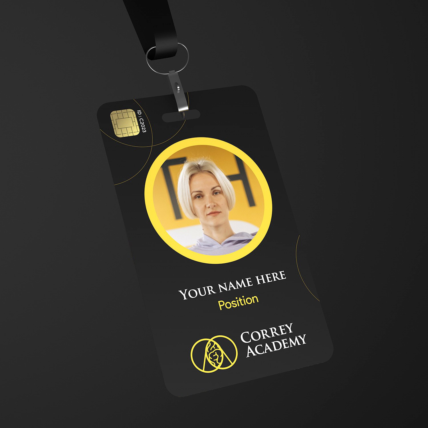
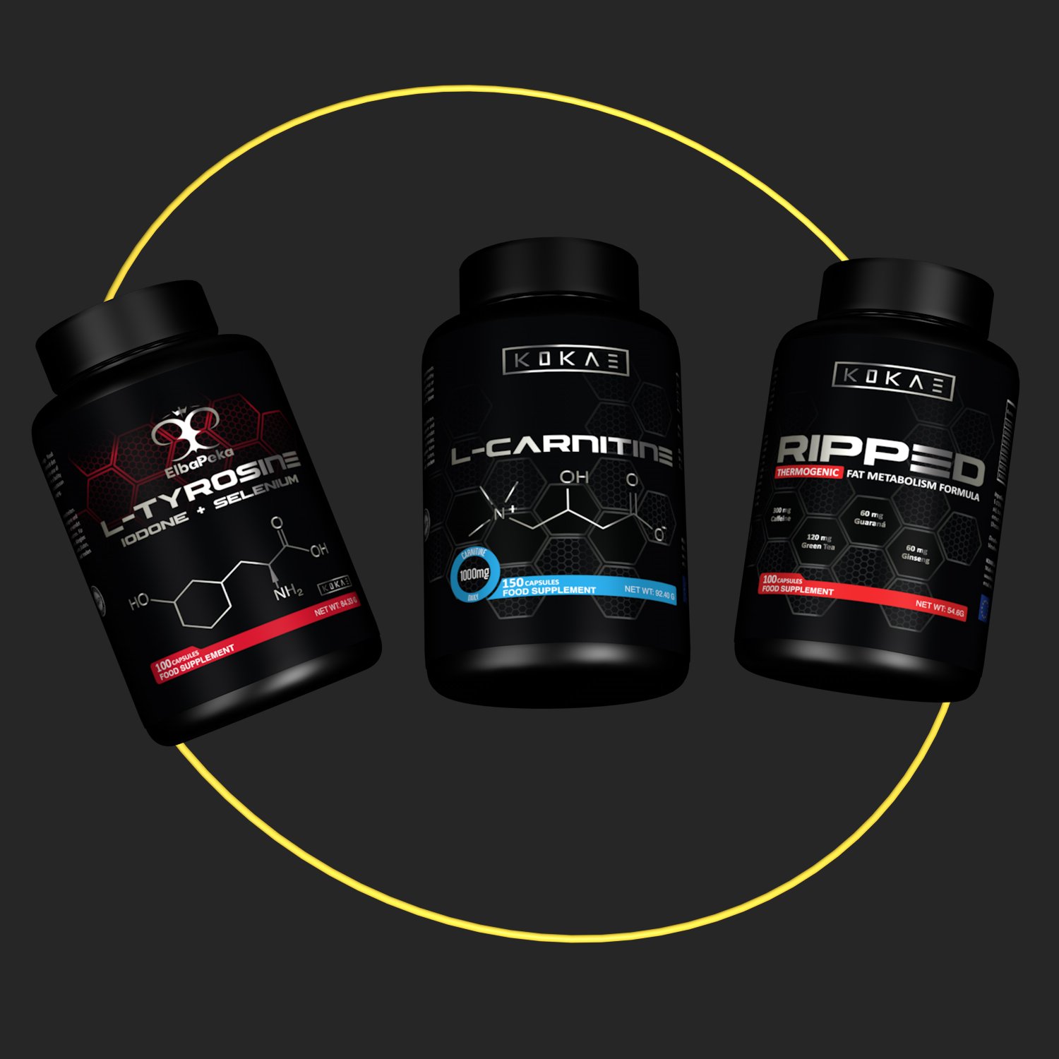
Correy Academy contacted us to design their logo and develop the visual identity system for the brand. The main concept revolves around the idea of uniting the client with the academy through the use of two interlocking rings as a distinctive symbol. Various ideas were explored during the project until we reached the final concept. The selection of colors, typography, and the design of corporate stationery were carried out. For the project presentation, we designed visual merchandising elements for the brand, social media templates, smartphone covers, and animations for the brand's products.
-
Our task was to create a symbol that represents the brand and create a coherence between all of its elements. As the ring is the main element of the concept everything is connected through circles, rings and organic shapes that convey vision of the brand.
Brand Colors
For the selection of colors we went for a palette that would communicate high end and premium quality, we achieve this by adding the color black together with yellow to invite the sense of life and energy.We added the color gray to invite the sense of balance and the color blue as a secondary accent color to evoque the sense of stability in the different branches of products and services of the brand.
Typography
Since the brand products and services are merged between tangible and digital, we went for a primary sans serif neo-grotesque type font to evoque the sense of welcoming, community and to keep a modern feel in the brand.The secondary font selection was based in the impact of the brand’s name. As the name have the word “Rey” that means “King” we decided to go for a roman capital serif type font to communicate the sense of importance which was used very often by the Romans to represent a high status hierarchy.
This branding project covers the logo design, corporate identity, brand color selection, typography selection, design of corporate material: Stationery, merchandising, POP materials, corporate pattern and templates for social media.
-
Expertise:
Corporate Identity, Brand Management, Brand Strategy, Copywriting, Art Direction, 3D Modeling, 3D Motion Graphics.
Tools:
Adobe Photoshop, Illustrator, After Effects, Premier Pro & Cinema 4D.Keywords:
Commitment - Education - Health - Fitness - Lifestyle - Longevity - Community


This project has been possible thanks to Correy Academy.


