BOOK COVERS
TYPOGRAPHY PROJECT
Book Editorial & Press Editorial
Typhography
Graphic design
2023
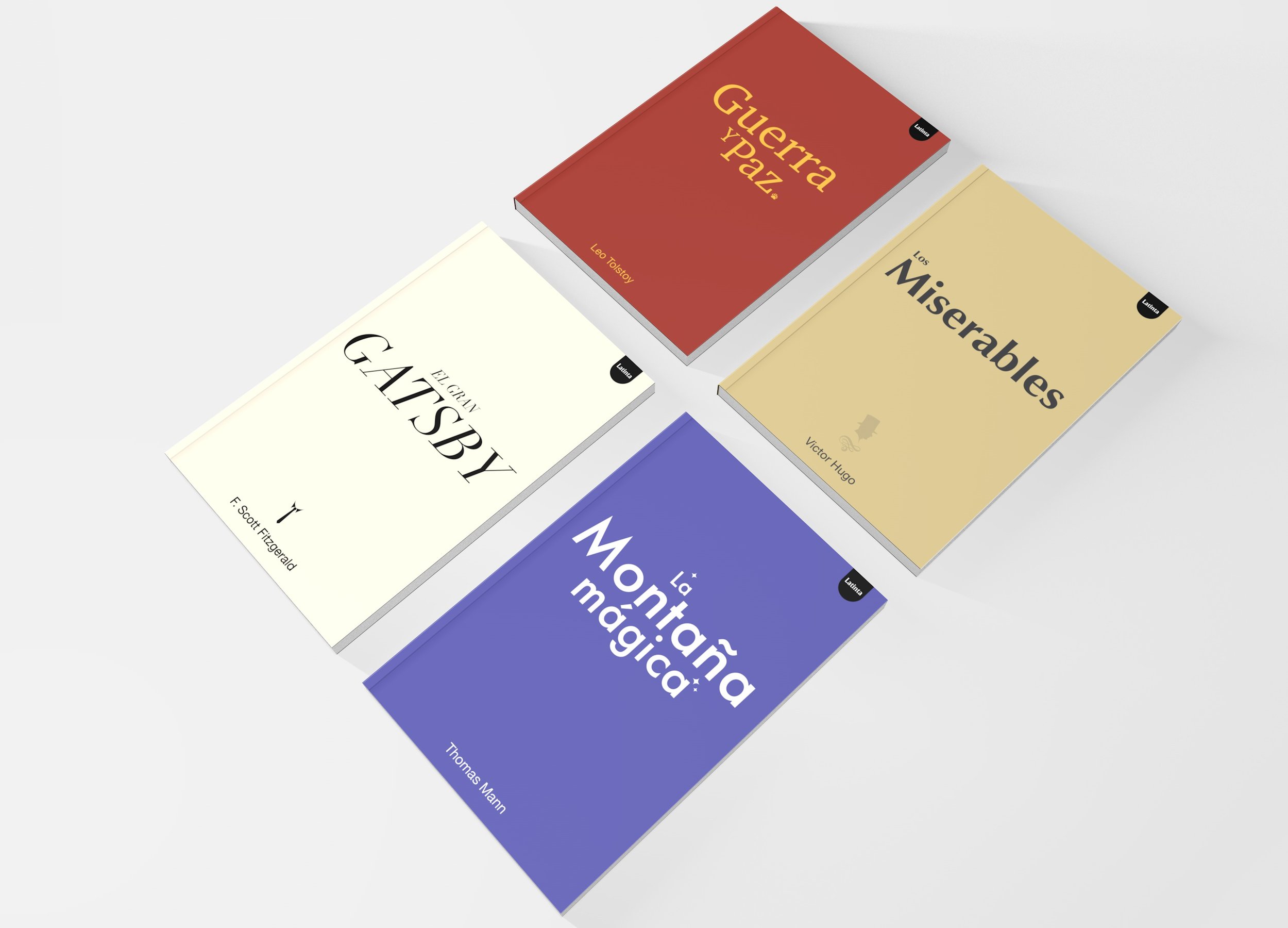
This project consisted of creating a collection of 4 book covers in which typography was the protagonist. For this project, the art direction focused on communicating the meaning of each of the works through color, typography and a distinctive element.
-
We made the decision to go for a minimalist and simple look and feel where typography played the main role. First I designed a logotype for the publisher which I called “Latinta” which is the combination of the words latino and tinta. For the covers I used color as a way of representing the novels. Red for war, begie color for the people, black & white for luxury, and purple for magic.
-
• War and Peace by Leo Tolstoy:
We used an old style serif typeface to represent the historical and traditional. Use the symbol of a bear claw to represent Russia.
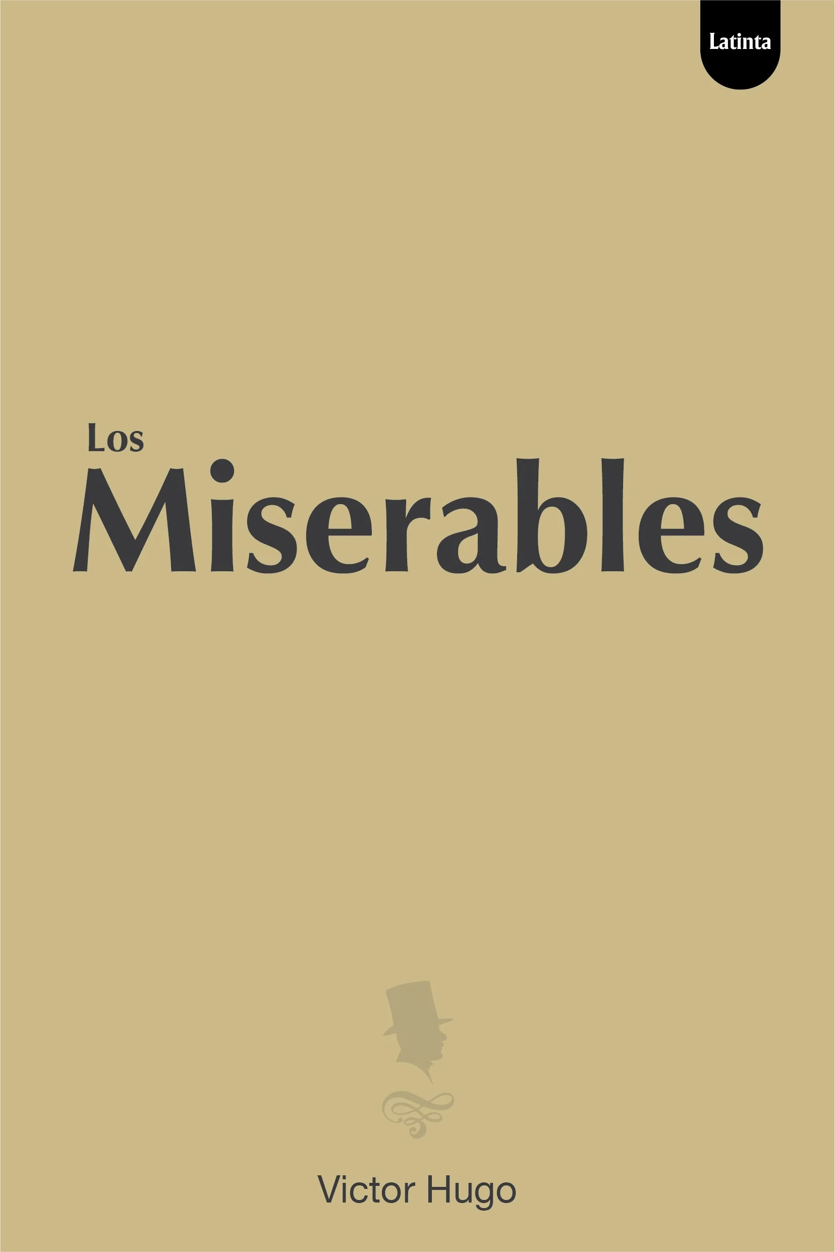
•Los Miserables by Victor Hugo:
We went for a sans humanist typeface to represent the people and the industrial revolution times. I used a translucent silhouette of a man in a hat to represent Madeleine
• The Great Gatsby by F. Scott Fitzgerald:
We used an italic didot typeface to evoke the luxury, elegance and dynamics of the interaction of the characters of the novel. As a small symbol I used the silhouette of a collar and a tie to represent Gatsby.
• Thomas Mann's Magic Mountain:
We went for Paul Renner’s Futura typeface to represent modernism, also I slanted the letters a bit to create the sense of floating in time-space as well as magical things. I used 4-pointed stars as a symbol to create the feeling that the text was magical.
-
Expertise:
Typhography Selection, Graphic Design, 3D modeling,
Tools:
Adobe Photoshop, Illustrator, Cinema 4D.
Keywords:
Books - Typography - Book Covers - Editorial Design


